Your competition slide can kill or close deals.
Investors spend more time on this slide than almost any other. They're checking if you understand the market. If you're realistic about challenges. If you have a winning strategy.
Most founders get it wrong. They claim no competition exists. Or they create confusing feature comparisons that say nothing.
This guide shows exactly how to build competition slides that convince investors. Real examples from successful pitch decks included.
What is a competition slide?
A competition slide shows how your startup compares to existing solutions in the market. It maps out direct competitors, indirect alternatives, and your unique position.
The slide typically uses visual formats like matrices, charts, or positioning maps. Your company appears alongside competitors with clear differentiation points.
Key components include:
- Direct competitors offering similar solutions
- Indirect competitors solving the same problem differently
- Your unique advantages and positioning
- Market gaps you're filling
Competition slides go by several names: competitive landscape, competitive analysis, or market positioning. The goal stays the same - prove you can win.
Smart founders use this slide to show market knowledge. They acknowledge real threats while demonstrating clear advantages. No fantasy land where competition doesn't exist.
The best competition slides answer three questions in seconds. Who else plays in your space? Why are you different? Why will you win?
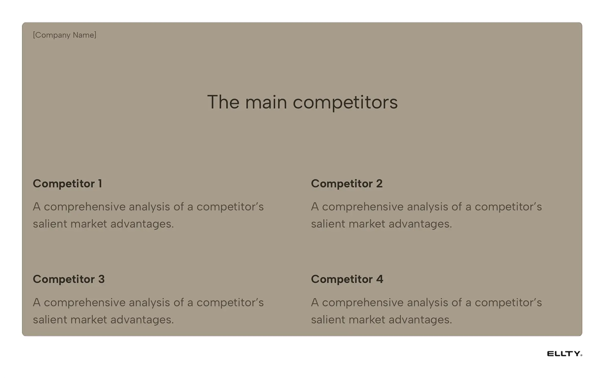
Competition slide examples
These templates include pre-designed competition slides. Each takes a different approach based on funding stage and investor expectations.
Investor pitch deck
Clean feature matrix. Your startup vs. 4-5 competitors.

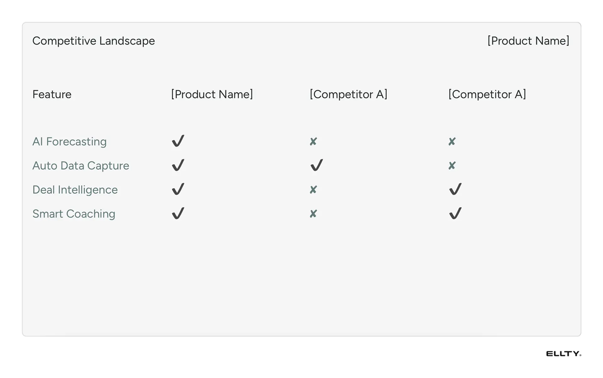
The slide lists key features vertically with competitor logos across the top. Checkmarks show capabilities. Your column highlighted.
Smart feature selection matters here. Pick what customers actually care about, not technical specs nobody understands.
Startup pitch deck
Quadrant positioning that actually makes sense.
Two axes create four spaces. Maybe price vs. quality. Or simplicity vs. power. You occupy the sweet spot.
Logos placed strategically. Your position stands out. The axes tell your differentiation story without walls of text.
Works great when you're disrupting lazy incumbents.
Fundraising pitch deck
Simple landscape view. Direct competitors here. Indirect ones there. You in the middle with a clear differentiator.
No complex matrices. Just who's in the market and why you're different.
First-time founders love this approach. Gets the point across fast.
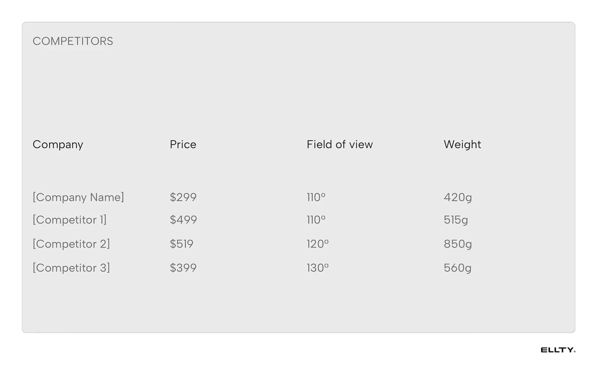
Series A pitch deck
Data-heavy comparison for serious rounds.
Market share percentages. Growth rates. Funding amounts. Customer counts. The metrics that prove you've done deep homework.
Your metrics highlighted. Choose numbers that show momentum - even if you're smaller, faster growth wins.
Built for investors who dig into details.
Mobile app pitch deck
App screenshots tell the story. Your clean UI next to their cluttered mess.
Includes app store ratings, download numbers, key features. Visual comparison makes the winner obvious.
Perfect when UX is your advantage. When design drives adoption.
Pick the format that fits your story. The structure's proven. Just add your data.


Key questions your competition slide must answer
Your competition slide needs to answer four questions in seconds. Miss one and investors lose confidence.
Who are your main competitors?
Name names. Include the obvious players everyone knows. Add the startups getting traction.
Direct competitors sell the same thing to the same people. Indirect ones solve the problem differently. Then there's the elephant in the room - what if Google decides to build this?
Investors already know the space. They're testing if you do. Leave someone obvious out and you look naive.
What makes you different?
Generic advantages don't count. "Better UX" means nothing. "Superior technology" sounds like BS.
Get specific. Maybe you process payments in 2 seconds while others take 30. Or you're the only platform with Shopify integration. Perhaps you work on mobile when competitors require desktop.
Your differentiation should be binary. You have it or you don't. Not "better" but "only."
Why will you win?
Differentiation isn't enough. Blockbuster had more locations than Netflix. Didn't matter.
What's your moat? Maybe network effects kick in after 1,000 users. You locked exclusive access to key data. Your founding team built this exact thing at Google. Patents pending on core tech.
Timing matters too. Why now? What changed - new regulations, consumer behavior, technology costs?
How big is the opportunity?
Competition validates market size. No competitors might mean no market.
Multiple players fighting means proven demand. If they're all growing, the pie is expanding. Their weaknesses become your entry point.
Position yourself as taking share in a growing market. Not fighting for scraps in a shrinking one.
Answer these four questions clearly. Your competition slide transforms from boring comparison to compelling opportunity.
What investors look for
Investors scan your competition slide for red flags. They've seen thousands of pitches. They know the tricks.


Market understanding
First test: do you actually know who you're up against?
Missing an obvious competitor kills credibility instantly. Claiming you have no competition kills it faster. Every business has competition - even if it's Excel spreadsheets or doing nothing.
Smart founders include competitors investors might not know. That new startup that just raised $10M. The enterprise player testing your market. Shows you're paying attention.
Realistic positioning
Investors hate fantasy positioning. You're not better at everything.
Amazon has worse UX than many retailers. Doesn't matter - they win on selection and speed. Know your actual advantages and own them.
The best slides show honest tradeoffs. "We're more expensive but 10x faster." Or "Limited features but dead simple to use." Investors respect clarity over claims of perfection.
Clear differentiation
Subtle differences don't build billion-dollar companies.
Your advantage needs to be obvious in five seconds. Not 5% better - fundamentally different. Uber didn't build a better taxi company. They eliminated the dispatcher.
If investors squint to see your differentiation, you don't have one.
Growth potential indicators
Your competition slide should hint at market dynamics. Who's growing? Who's struggling? Where are the gaps?
Maybe incumbents are slow because they serve enterprise. Your opening: SMBs desperate for simpler solutions. Or everyone focuses on features while customers scream about price.
Show where the market is heading, not just where it is today. Investors bet on future market leaders, not current feature comparisons.
Watch their eyes during pitch meetings. They'll spend longest on your competition slide. It tells them if you're building a real business or just another feature.

Design tips
Design can make or break your competition slide. Pretty graphics mean nothing if investors can't extract information fast.
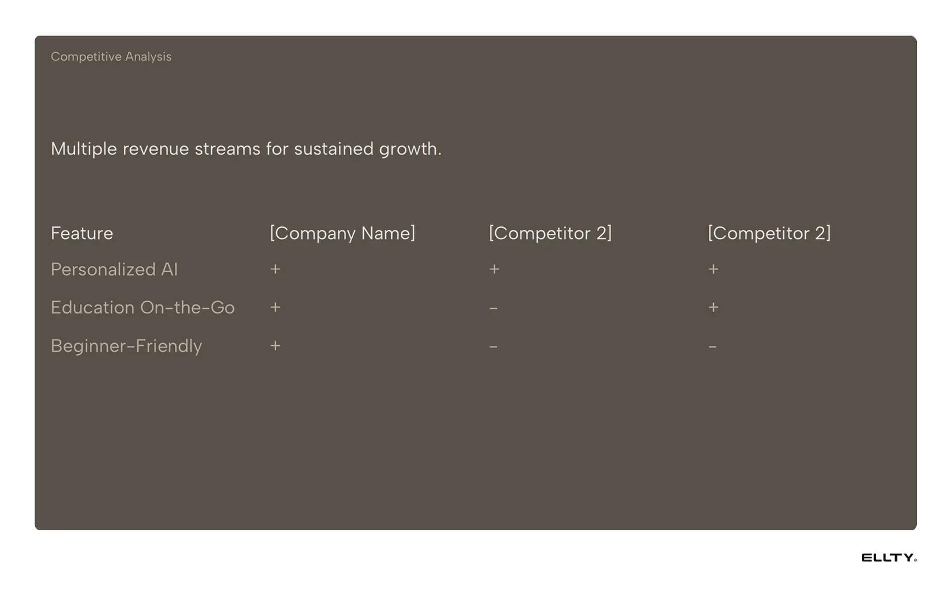
Visual formats (matrices vs tables)
Feature matrices work when comparing capabilities. You on the left, competitors to the right. Checkmarks show who has what.
Quadrant charts excel at positioning. Two variables create four spaces. You occupy the sweet spot.
Tables handle hard data - market share, growth rates, funding. Numbers tell stories.
Pick the format that makes your advantage obvious.
Colors
Your brand color makes you pop. Competitors in grayscale. The contrast draws eyes immediately.
Skip the red-yellow-green traffic lights. Use your brand color for strengths, gray for everything else.
Two colors maximum. More becomes a rainbow nobody can decode.
Logo placement strategy
Your logo 20% larger, not double. Subtle dominance beats obvious manipulation.
Arrange competitors logically. Market leaders first. Challengers middle. Startups at edges.
High-res logos only. Pixelated competitors make you look amateur.
The 5-second test
Show your slide to someone unfamiliar with your business. After 5 seconds, hide it.
Can they identify your main competitors? Your key advantage? Why you'll win?
If not, simplify. Remove data. Increase contrast. Make your position impossible to miss.
Most founders pack too much into competition slides. Strip it down. Show only what proves your point.
How to build your competition slide
Four steps to a competition slide that actually converts investors.
Step 1: Identify direct and indirect competitors
Direct competitors sell similar solutions to your exact customers. List 3-5 maximum. More clutters the slide.
Indirect competitors solve the same problem differently. Excel counts. So does hiring internally. Or doing nothing - often your biggest competitor.
Research beyond Google. Check ProductHunt for new entrants. Read industry reports. Ask potential customers who else they evaluated. The competitor your customer almost chose matters more than some random startup.
Step 2: Choose 4-6 comparison parameters
Pick dimensions that highlight your strengths AND matter to customers.
Bad parameters: "Innovation," "User Experience," "Technology Stack." Too vague. Means nothing.
Good parameters: "Setup time: 5 minutes vs 2 weeks." "Price: $10/user vs $50/user." "Mobile app: Yes/No." Binary and specific wins.
Match parameters to customer pain points. They complain about integration headaches? Compare integration time. They hate per-seat pricing? Show your flat rate.
Step 3: Create your visual matrix
Start simple. Your solution versus 3-4 others.
Position yourself strategically but honestly. You can't win everything. Amazon has terrible UX compared to boutique sites. They win anyway.
Consistent visual language matters. Checkmarks for yes/no. Numbers for metrics. Colors for your strengths. Don't make investors decode your symbols.
Step 4: Position your product
Your placement tells a story.
Write one line explaining your position. "Enterprise power at SMB price." Done.
Avoid weak positioning like "best of both worlds" or "perfect balance." Nobody believes it. Take a stand. Own your quadrant. Be the fastest, cheapest, simplest, or most powerful. Not all four.
Test with advisors. They'll spot BS positioning instantly.
Common mistakes
These errors kill more pitch decks than any other slide.
"We have no competitors"
Investors hear this and think you're either lying or clueless.
Fix: Show indirect competitors. Excel spreadsheets. Status quo. Doing nothing. Something fills the need today.
Too much information
Feature comparison with 47 checkmarks. Tiny logos everywhere. Information overload.
Fix: Maximum 5 competitors, 6 comparison points. Save details for appendix.
Dishonest comparisons
Cherry-picking features where only you excel. Using outdated competitor data.
Fix: Use current, verifiable data. Include areas where competitors are strong. Makes your advantages believable.
Ignoring the giants
"We don't compete with Google/Amazon/Microsoft."
Three months later: "Google just launched exactly what you're building."
Fix: Add "If tech giants enter" section. Show your defensive strategy. Have an answer ready.
The best competition slides show confidence through honesty. You know the threats. You'll win anyway.
Other pitch deck slides explained
From title slides to financial projections - we cover every slide that matters.
Go-to-market slide →
Problem slide →
Why now slide →
Customer acquisition slide →
Start building your competition slide
You know what works. Time to build yours.
Each includes a proven competition slide. Customize with your data. Track what investors actually look at.
Your competition slide shouldn't kill deals. It should close them.